Have you ever thought that charts are just the market data represented in many different ways? Yes, they surely are! Some of them are becoming the unique analysis tools the traders can barely do without. The more ways, the better! That’s why DXcharts is not limiting you to just a few popular chart types and along with these allows making custom aggregations and timeframe presets. Today we will look at new great opportunities for a trader to utilize the market data.
Equivolume Chart Type
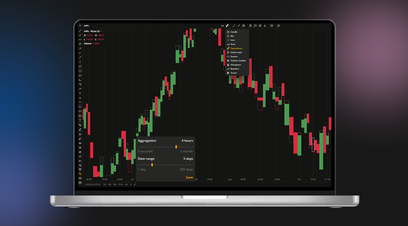
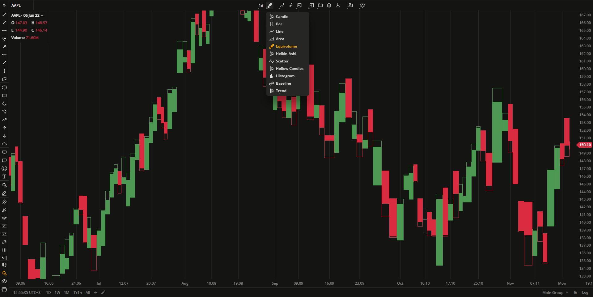
There cannot be enough chart types! Please welcome the new one – Equivolume! At first glance it is similar to a candle chart but if you take a closer look, you will see the difference.
First, the Equivolume bars are plotted together representing the price ranges of a security – High/Low prices. Next, the Equivolume chart does not show the open price but the close price can be displayed, if need be, in Settings > General > Show close price.
The last difference is the adjustable width of the bars. The width proportionally corresponds to the volume traded during the aggregation period. That’s it!
Price-Based Aggregation Period – Range
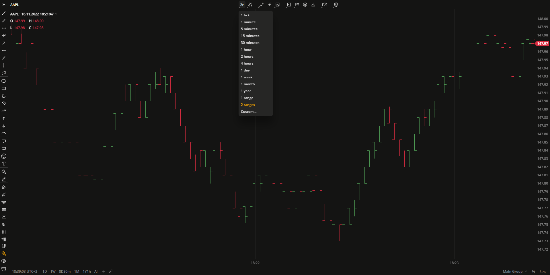
The next important feature of the latest update is the Range aggregation. Most of us are probably used to time charts, i.e. the charts using time-based aggregation periods when plotting bars: 5 seconds, 1 minute, 2 hours, 1 day, and so on. Meanwhile, the price-based or range charts consider only price movements instead of time units. It means the number of bars on the chart will depend on the volatility of the chosen security. Each bar in the price-based chart must have a high/low range that equals the specified range.
In DXcharts, you can set the range aggregation for the Bar chart. Do not forget about the custom aggregation where you can specify 2 ranges, 7 ranges, or “as-many-as-you-want” ranges.
Custom Timeframe Presets
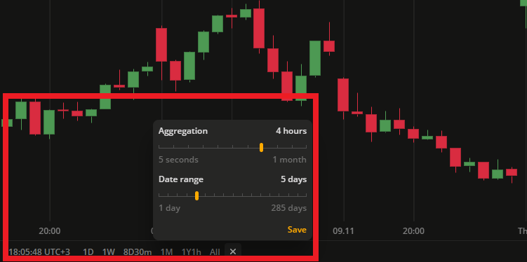
DXcharts has also acquired a flexible tweaking tool for creating timeframe presets in one of the recent releases. Adjust an aggregation period (the time period of 1 bar), set a date range and save these as a timeframe preset. The preset is then displayed on the quick access panel at the bottom-left corner of the charts and available in one click from there.
Every custom aggregation corresponds to a specific date range. You can check the available combinations for a custom timeframe preset in the table.
| Aggregation | Date range |
|---|---|
| 5 seconds | 1 hour, 12 hours; 1 day |
| 5 minutes | 1-10, 20, 25, 30, 60, 90 days |
| 15 minutes | 1-10, 20, 25, 30, 60, 90 days |
| 30 minutes | 1-10, 20, 25, 30, 60, 90 days |
| 1 hour | 1-10, 20, 25, 30, 60, 90, 180, 285 days |
| 2 hours | 1-10, 20, 25, 30, 60, 90, 180, 285 days |
| 4 hours | 1-10, 20, 25, 30, 60, 90, 180, 285 days |
| 1 day | 1, 3, 6, 9 months; 1-10, 15, 20, 25 years |
| 1 week | 3, 6, 9 months; 1-10, 15, 20, 25, 30 years |
| 1 month | 1-10, 15, 20, 25, 30 years |
The flexible set of tools provided by DXcharts can become a good opportunity to implement the most daring investment ideas and make use of complex trading strategies.
Stay tuned for more updates,
The DXcharts team


