- DarkLight
Release notes
- DarkLight
Version 5.10.1
Release date: Apr 25, 2024
Bug fixes and improvements
- Fixed an issue where navigation arrows were not displayed for expand/collapse sidebar.
- Fixed an issue where chart sometimes had incorrect initial viewport.
- Added the ability for the data provider to update the full history using a callback, similar to the existing one. Example:
requestHistoryData(symbol, ...etc, callback: (data: CandleData[]) => void): void
Version 5.10.0
Release date: Apr 23, 2024
Easy way to put your logo on your charts
We've simplified the process of adding a logo to your charts.
Magnet mode on a Multichart layout
Magnet mode, a feature that turns on/off the ability to snap drawings to the candle elements, now also works on a Multichart layout.
New 8-charts layout for Multichart
We've added an additional layout for the Multichart menu. Now, the working area can hold up to 8 different charts without losing the overall performance and stability.
Trading hours and market state for selected instrument
We've added the possibility to view the current market state (open/closed), the exchange working hours, and the time untill the exchange opens for selected instrument. Hover overto see the details on the exchange work for the current instrument.
The chart shows the loading state during the accumulation of trade data
We've added a loader/load state to the widget and charting library, now the screen flickers when the trade data is still accumulating and loading.
Loading the trade data
Google Analytics for the library and widget
Now, you can use Google Analytics for your purposes in the charting library and the widget.
Bug fixes and improvements
- Added API method to configure placing of OCO orders from the Order menu
- Chart icon scale is now saved correctly in the layout
- Fixed an issue where multiple charts were sometimes displayed offset from each other
- Corrected export data accuracy for volume on charts
- Fixed incorrect order of column names when exporting chart data
- Fixed an issue with dragging a baseline in the Baseline chart type for Edge browser
- Removed an insecure call used to calculate formatters for time to improve content security policies in Electron
- Fixed an issue where switching themes in the advanced widget did not work properly
- Fixed widget issues specific to Safari browser
- Adjusted the maximum zoom out to prevent the chart diagram from scrolling off-screen
- Fixed an issue where changes made in dxScript were not dispalyed in GUI
- Updated incorrect package.json version published with releases
- Improved effects for default timeframe presets and aggregation behavior on mobile phones
- Updated the text for the trial watermark to improve clarity
- Fixed "Download chart image" error for smoother operation
- Y-axis configuration in the advanced widget now works properly
- Added the possibility to hide the main chart area on mobile phones
- Y-axis bounds are now properly set after chart initialization with visible === false
Indicators and drawings
- Fixed an issue where undo/redo did not work properly when synchronizing drawings across multiple charts
- Fixed crashes in charts after adding a drawing and activating multichart mode
- Fixed incorrect icon for Fibonacci Circles drawing
- Fixed ability to create empty Text/Callout drawings
- Fixed an issue with ignoring labels in the price scale settings for new indicators
- Fixed an issue when drawings with highlighted labels don't show seconds
- "Reset to Default" button now works correctly when changing some drawing settings
- Fixed an issue where the opacity of the indicator did not change
- Fixed dispaly issues with TD Sequential indicator
- Fixed an issue with length parameters of Linear Regression Channel indicator
- Fixed incorrect calculation of bounds for indicators
- Fixed incorrect icon used for removing indicators
Miscelanious
- Released documentation v.1.0.2 for Android library
- Successfully integrated with Vite
Version 5.9.2
Release date: Mar 13, 2024
Bug fixes and improvements
- Fixed an issue with incorrect countdown label on a price scale.
- Fixed an issue where multiple taps were required to select objects on the chart.
- Fixed an issue with indicators disappearing after changing aggregation periods.
- Fixed an issue with scrolling speed on touchpad.
Version 5.9.1
Release date: Mar 7, 2024
Bug fixes and improvements
- The selection of chart objects (e.g. news/events/drawings) now works correctly after multiple taps.
- Fixed an issue when drawings are not removed from Dynamic objects properly.
- Fixed an issue with incorrect applying default values on drawings config.
- Fixed an issue with the colors when changing a layout.
- Users can now type the ":" symbol into the Text drawing.
- Exception errors no longer occur in the log after adding drawings for a new layout.
- Price labels on the Price scale now work for all aggregation periods.
- Fixed an issue with reseting all changes to default in the Multichart layout.
- Trading: execution tooltips are now consistently displayed in bubble mode.
Version 5.9.0
Release date: Feb 19, 2024
Bug fixes and improvements
- Fixed an issue with not changing the source for Regression Trend drawing.
- Trading from chart > executions > bubbles mode: fixed an issue with wrong aligned tooltips and line.
- Fixed an issue with incorrect displaying of the date and time presets.
- Fixed an issue when "Move scale to the left" doesn't work for indicators and volume.
- Fixed an error when exporting data to CSV.
- Fixed an issue with indicators not being displayed in the overlaying mode.
- Fixed an issue with wrong timezone saved in CSV report.
- Fixed an issue with incorrectly displayed values in Fibonacci Channel drawing on a percent scale.
- Negative values for Fibonacci drawings can now be used in the parameters.
- Fixed an issue with disapperaing drawings in multichart layouts.
- Fixed an issue with dxScript export not working for some scripts.
- Fixed an issue with wrong order direction when issuing an order.
- Added the Length input to the Linear Regression Channel indicator.
Version 5.8.3
Release date: Jan 22, 2024
Bug fixes and improvements
- Fixed an issue with not applying layout changes.
- Fixed an issue with reseting theme colors to defaut when choosing a layout.
- Fixed an issue with disappearing drawings after selecting synchonization in the Multichart mode.
Version 5.8.0
Release date: Dec 27, 2023
Trading from chart
We have added the Trading from chart feature, which allows you to place orders from the Order menu, Legend or from the shortcut menu by right-clicking on the chart area. For details, see Trading from chart.
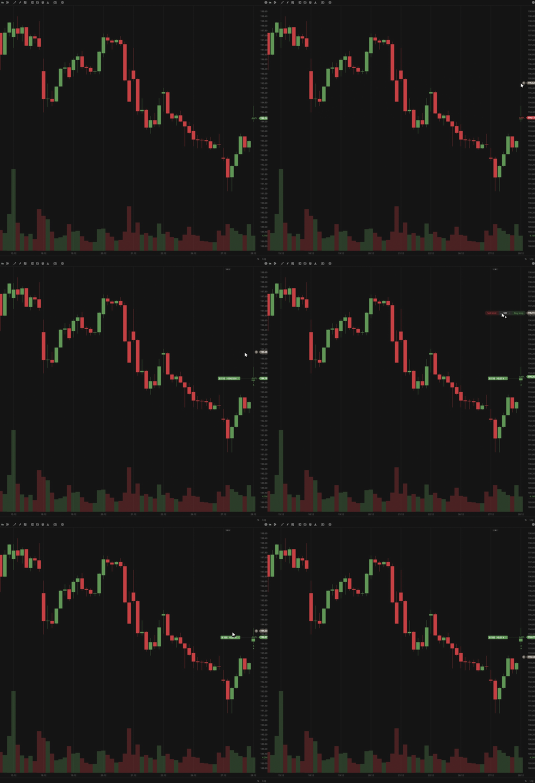 Trading from Order menu
Shortcut menu
The settings and some actions are now also duplicated in the shortcut menu, which is available by right-clicking the chart area.
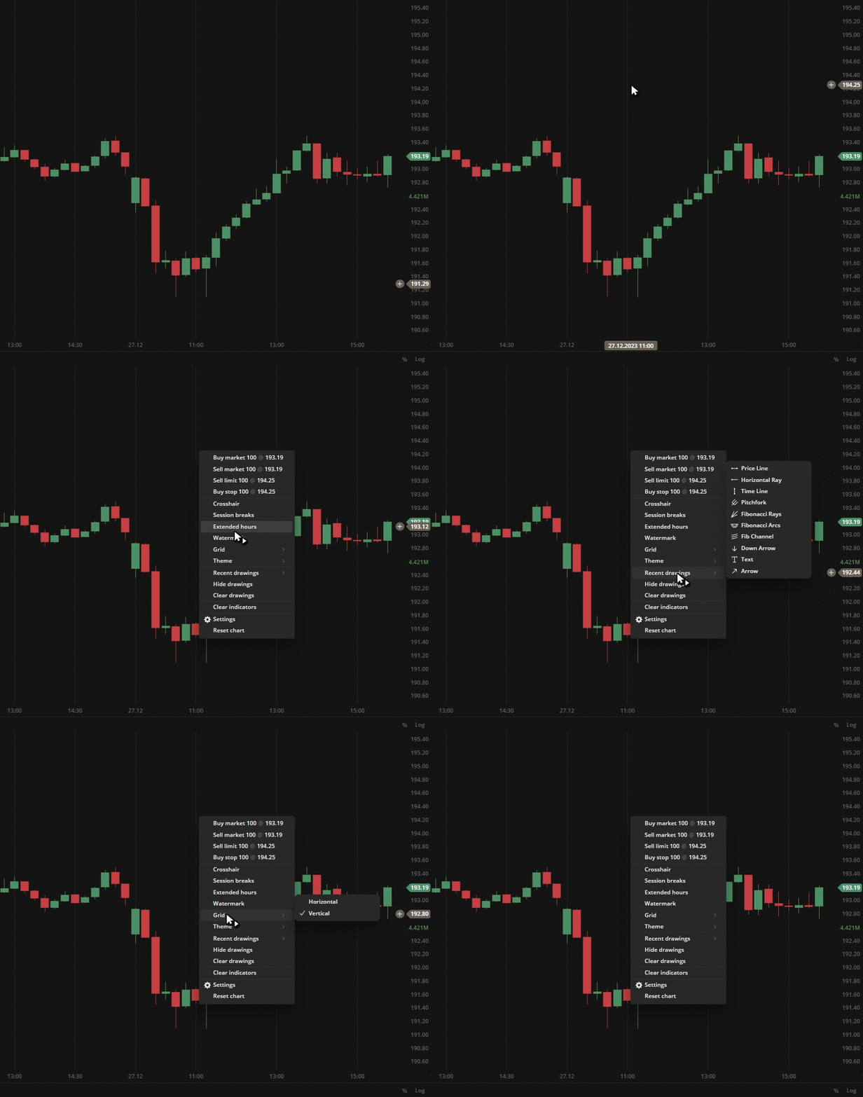 Right-click on the chart
You can perform the following actions from the shortcut menu:
- Place Market, Limit or Stop orders (for details, see Trading from chart);
- Turn on/off objects and settings of the chart area:
- Crosshair;
- Session breaks;
- Extended hours;
- Watermark.
- Turn on/off grid lines on the chart:
- Horizontal;
- Vertical.
- Switch themes:
- Dark;
- Light.
- Perform actions with drawings:
- Launch the most recently used drawings;
- Hide drawings;
- Clear drawings.
- Settings - quick access to the rest chart settings.
- Reset chart - sets the default settings for the entire chart area.
Bug fixes and improvements
- Resolved an issue with setLayerItems in the chart-react API.
- Fixed an issue in the chart-react API caused by view-models lazy loading refactoring.
- Fixed a precision error with executed orders.
- Updated DXcharts Lite to a newer version to enhance chart performance.
- Fixed the incorrect initial value on rendering in autoscale.
- Fixed an issue with disabling auto-scale price axis after left-clicking.
- Resolved an issue when autoscaling doesn't work if both scale and instrument are changed.
- Fixed an issue with creation of unnecessary hover data.
- Fixed an issue with clearing up of studies-related data on the chart.
- Ensured that the scale is correctly saved into the layout after initial load.
- Fixed the saving of auto-scale price axis setting in a multichart configuration.
- Resolved an issue that prevents trading mode from being enabled in a multichart configuration.
- Plain labels are now correctly displayed with their designated text color.
- Added ability to add colors via config for drawings.\
Version 5.6.8
Release date: Oct 17, 2023
Bug fixes and improvements
- Developed an API to modify the appearance of all labels including studies (indicators) and the last label.
- Fixed an issue when "Restore to Default" doesn't affect parameters in the edit fields for indicators.
- Restructured the ServiceDataProvider interface to use Callback/Promise.
- Fixed the order of labels in the Price scale.
- Redesigned and fixed bugs in Trading from chart functionality.
- Fixed an issue when Drawing active state point is always on top.
- Fixed an issue when a pointer can't be moved to the descriptions popover position.
- Fixed an issue with displaying Line and label Previous day's close price when aggregation period > 23h.
- Fixed an issue with removing dxScript study form the list after closing the edit popup.
Version 5.5.0
Release date: Aug 8, 2023
Bug fixes and improvements
- Implemented lazy loading for all chart popups and dropdows.
- Updated chart production mode for V1, V2, and V3 environments.
- Refactored chart-core to support multiple scales.
- Fixed an issue when the settings popup can be dragged outside the window.
Version 5.4.0
Release date: Jun 14, 2023
Bug fixes and improvements
- Fixed an issue with chart lagging when zooming in Firefox.
- Fixed an issue with a Legend data box for certain chart types.
- Fixed an issue with aggregation period glitch in the Multichart mode with enabled sync.
- Fixed an issue with active drawing moves when browser window is resized.
Version 5.3.0
Release date: May 23, 2023
Bug fixes and improvements
- Fixed an issue in the Multichart mode when an aggregation period and Range synchronization don't work properly.
- Fixed an issue with the auto-scale feature in the Advanced widget.
- Fixed an issue with the chart positioning after adding a custom aggregation period or opening multiple charts.
- Fixed an issue when Doji candles are not displayed when the candle has no price change.
- Fixed an issue with slow refreshing of studies (indicators).
Version 5.2.1
Release date: May 5, 2023
Bug fixes and improvements
- Fixed an issue with a wrong position of the Label and lines submenu in Chart settings.
- Fixed an issue with an incorrect display notification when there is no data available for the instrument.
- Fixed an issue with accessibility - the anchor is not focused correctly when the popover is closed.
- Fixed an issue with not invoking the "Reset to Default" item in the Chart settings.
- Fixed an issue with drawings disappearing when restoring default settings.
- Fixed an issue with changing transparency in Chart settings.
Version 5.0.0
Release date: Dec 21 2022
Equivolume chart type
A new chart type, Equivolume, has been added. It is similar to a Candle chart but with some key differences. First, the equivolume bars represent the price ranges of an asset (high/low) prices and do not show the open price. However, the close price can be displayed if needed. To turn it on, go to the Settings > General > Show close price.
The second diffirence is the adjustable width of the bars, which corresponds proportionally to the volume traded during the aggregation period. For details see Equivolume.
.png) The plotted equivolume bars are of different widths
The plotted equivolume bars are of different widths
Price-based aggregation period - Range
The latest update includes a new feature called Range aggregation. Whil time charts use time-based aggregation periods to plot bars, such as 5 seconds, 1 minute, 2 hours, or 1 day, range charts consider only price movements instead of time unitns. This means that the number of bars on the chart will depend on the volatility of the chosen security. The price-based chart should display each bar with a high/low range that matches the specified range.
You can use the range aggregation only in the Bar chart type. Additionally, custom aggregation allows you to specify the number of ranges: 2 ranges, 7 ranges, or "as-many-as-you-want" ranges.
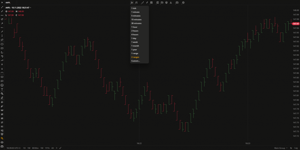 The Bar chart with the aggregation period set to 2 ranges
Custom aggregation periods
In this release, we have added a flexible tool for creating aggregation presets. This tool allows you to adjust the aggregation period (the time period of 1 bar), specify a date range, and save these as a preset. The preset will then be displayed on the quick access panel at the bottom-left corner of the charts and can be accessed with just one click.
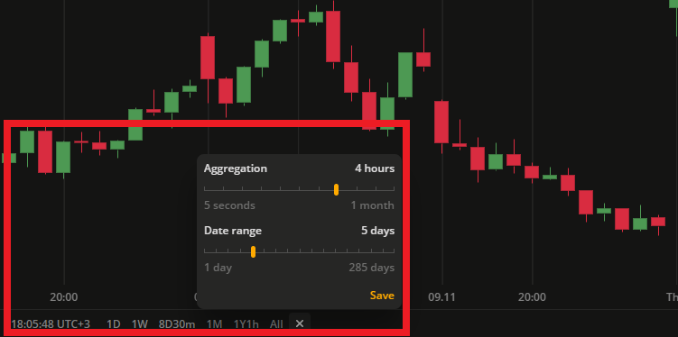 Add up to 15 ready-to-use aggregation presets
Version 4.9.0
Release date: Oct 21, 2022
Drawing groups in Object tree (Layers)
Drawing groups is a feature that allows you to group drawings and operate them as a single set through the Object tree (Layers) box. The Layers box displays all the drawings placed on the chart.
![]() Find the Layers icon on the ToolbarIn the Layers box you can perform the following actions:
Find the Layers icon on the ToolbarIn the Layers box you can perform the following actions:
- Create, rename or delete drawing groups.
- Hide and show drawings / drawing groups on the chart.
- Lock or unlock drawings / drawing groups from editing on the chart.
- Move drawing between drawing groups.
- Change the order of objects in the Layers tree.
.gif) Show/Hide all the text in one click!The number of actions and objects in the Layers is going to be extended in the future to cover all chart activity. In the Multichart mode, the Layers box will display a unique set of drawings belonging to the selected chart only.
Show/Hide all the text in one click!The number of actions and objects in the Layers is going to be extended in the future to cover all chart activity. In the Multichart mode, the Layers box will display a unique set of drawings belonging to the selected chart only.
Chart settings redesign
This change is purely visual. The settings menu style has been updated to enhance its appearance and accommodate the increased number of available settings.
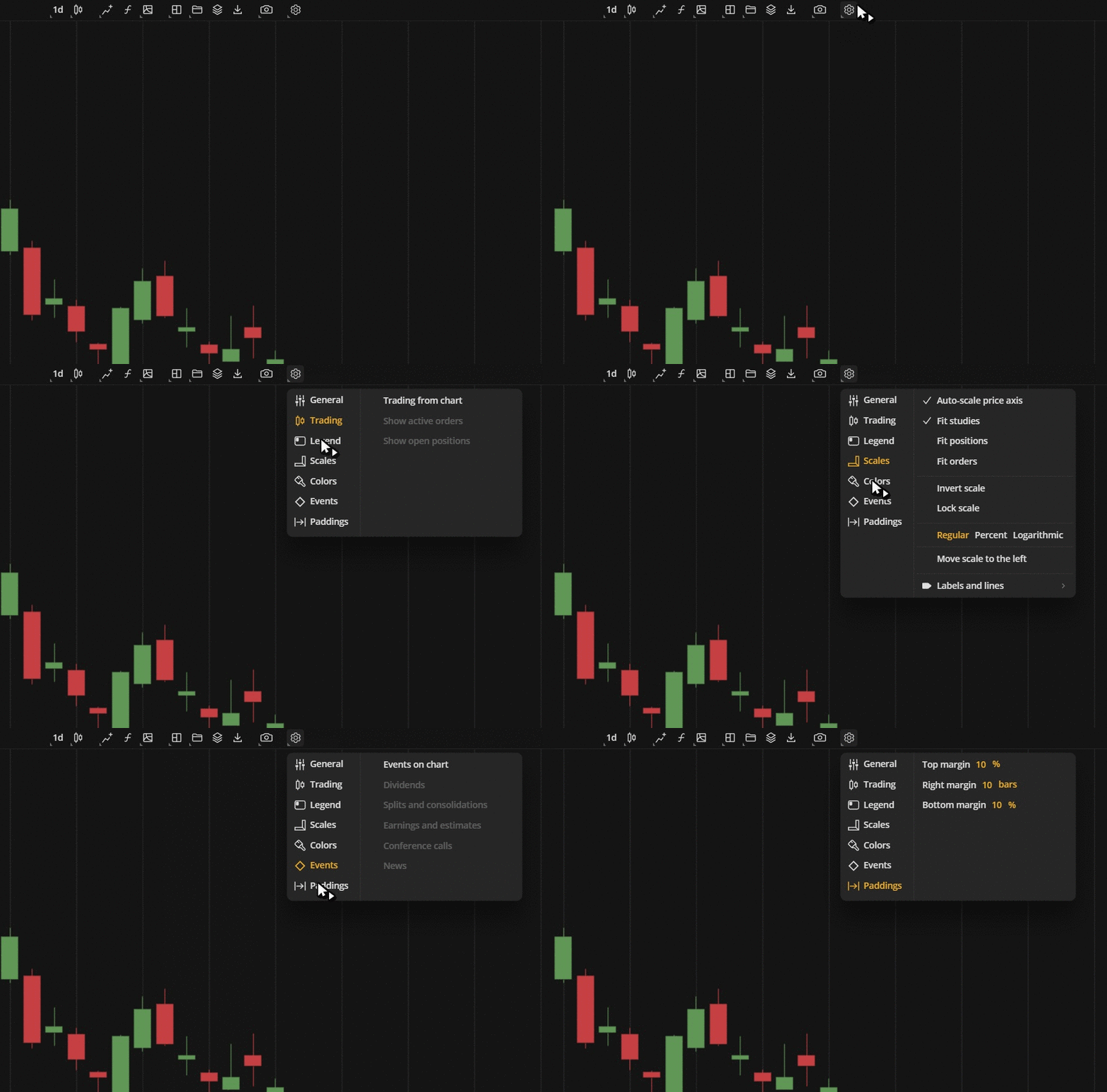 Settings redesign
Tooltips for studies (indicators)
Although some indicators may appear similar, they can differ significantly in their core functionality. When selecting an indicator, it's important to carefully review the descriptions to ensure that you rae choosing the appropriate one. To access the description of a study, simply click on the question mark icon located next to the indicator's name to display the tooltip.
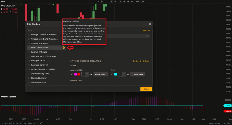 Awesome Oscillator description
Version 4.8.0
Release date: Jun 27, 2022
WaveTrend indicators
We have added two more predefined studies (indicators) for you to use: WaveTrend and its advanced version - WaveTrend with crosses. These oscillators are often used by both day traders and swing traders. WaveTrend is an oscillator based on market wave theory that helps identify overbought and oversold areas. The version with crosses has dots that signal buy and sell opportunities.
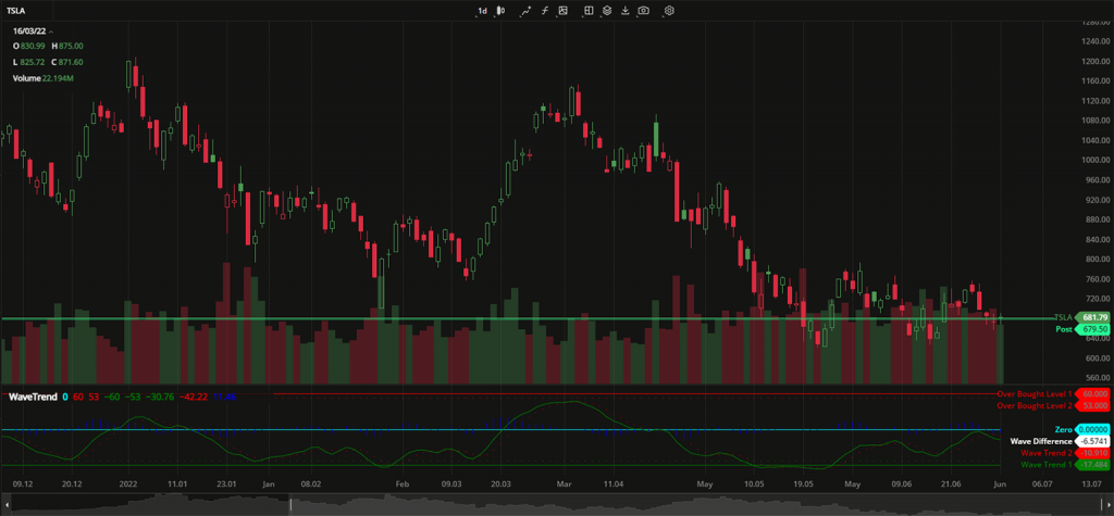 WaveTrend
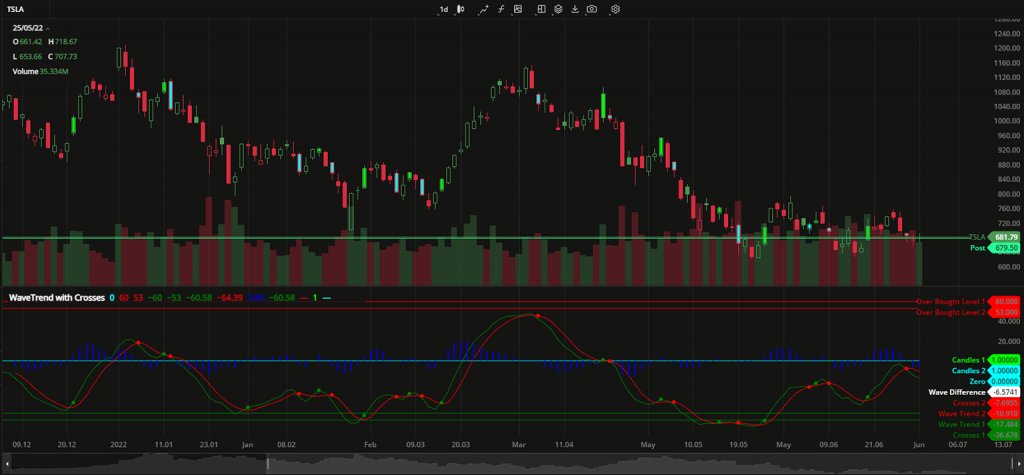 WaveTrend with crosses
Regression Trend drawing
Regression Trend is a channel-like drawing based on a trendline. It has upper and lower deviation levels plotted at the same distance from the trendline. The main idea of this drawing is to identify where the price exceeds these deviation levels.
.gif) Regression Trend drawing
Regression Trend drawing
Tick aggregation
The chart now has the option to display every tick price change through 1 tick aggregation. Custom aggregation periods can also be created with any desired number of ticks, such as a 2 tick chart or 5 tick chart, and so on.
Chart settings: Align stamps to session start
This setting synchronizes the candles on the chart with the market opening time. Once the first data appears, you'll see the volume bars.
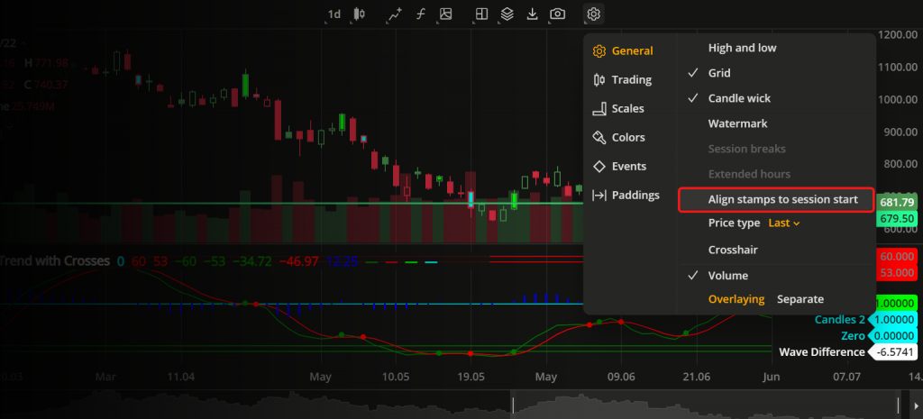 Align candles with sessions
Chart settings: Additional price type
Last price type is now available. Select it to display the candles showing the latest market prices for your instrument on the chart. The full list of price types to build the chart with is now the following:
- Last. The most recent price at which deals were made in the market.
- Market. The current available price in the market.
- Bid. The highest price offered for buying available in the market.
- Ask. The lowest price offered for selling available in the market.
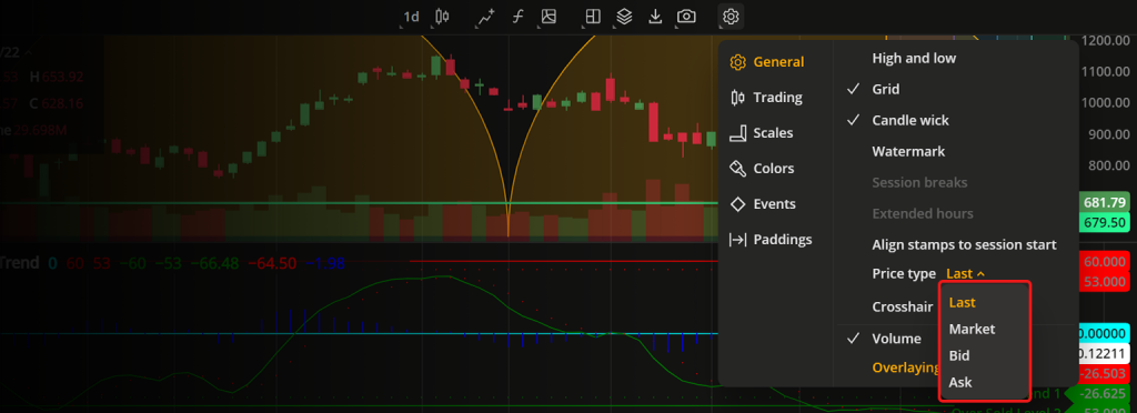 Price type settings
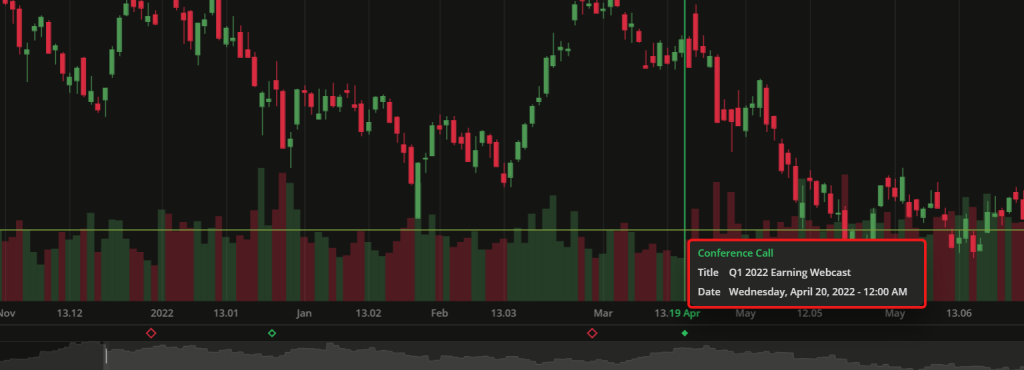
Conference Call event
Events are a useful way to ensure you don't miss a regular call during the trading session. We have added a new type of an event - Conference Call. You can activate it in the Chart Settings to see notification signs of such events at the bottom of the chart.
Version 4.6.0
Release date: Apr 19, 2022
Trend chart
We have added a new chart type - Trend. The Trend chart is similar to the Candle chart but with different coloring patterns. The candles are colored bullish or bearish depending on the opet and close values of the current and two adjacent aggregation periods. For details, see Trend chart.
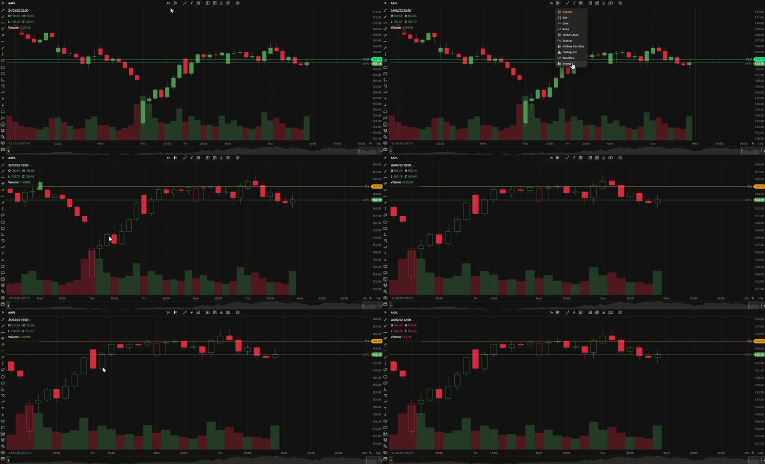 Trend chart
New studies and dxScript improvement
We have added 14 new technical indicators. Now, you can apply even more advanced mathematics to your technical analysis and spot trends as they emerge. Traders who prefer to write their own indicators using our dxScript language, now able to specify the plot type and color direcly in the code when editing an indicator.
The new studies (indicators) in our toolbox are:
- Advance/Decline. A cumulative indicator that plots the difference between the daily number of advancing and declining units. It can be used to confirm a price trend and alert a trader to the possibility of a trend reversal.
- Average Directional Index. This indicator is used to measure the strength or weakness of a trend over time. This directional index study is derived from smoothed averages of the difference between +DI (Plus Directional Indicator) and -DI (Minus Directional Indicator).
- Balance of Power. This study uses the price to measure buying and selling pressure by showing how much the price has changed.
- Bollinger Bands %B. This indicator is used together with the main Bollinger Bands study and shows where the price is in relation to the bands.
- Bollinger Bandwidth. This is another companion indicator to Bollinger Bands that shows the distance between the upper and lower bands.
- Chaikin Money Flow. This indicator, created by Marc Chaikin, shows the distribution and accumulation of an instrument. It works as follows: the closer the close to the high, the more accumulation.
- Commodity Channel Index. This is the oscillation study that shows the difference between the current price and the historical average price.
- EMA Cross. This is a variation of the EMA (Exponential Moving Average) indicator that shows the crosses between the 9-day and 26-day EMA.
- Fibonacci Bollinger Bands. This is a variation of the standard Bollinger Bands where the baseline is a simple moving average and each band is a Fibonacci ratio of the ATR (avwerage true range) from the baseline.
- Kaufman Moving Average Adaptive. This EMA-based indicator reacts to trends and volatility. When the line moves down, it indicates a downtrend; when the line moves up, it indicates an uptrend.
- Triple Exponential Average (TRIX). This is an indicator that helps visualize both trend and momentum. When used as an oscillator, it shows potential peaks and troughs; when used as a momentum indicator, it helps filter out irrelevant price spikes.
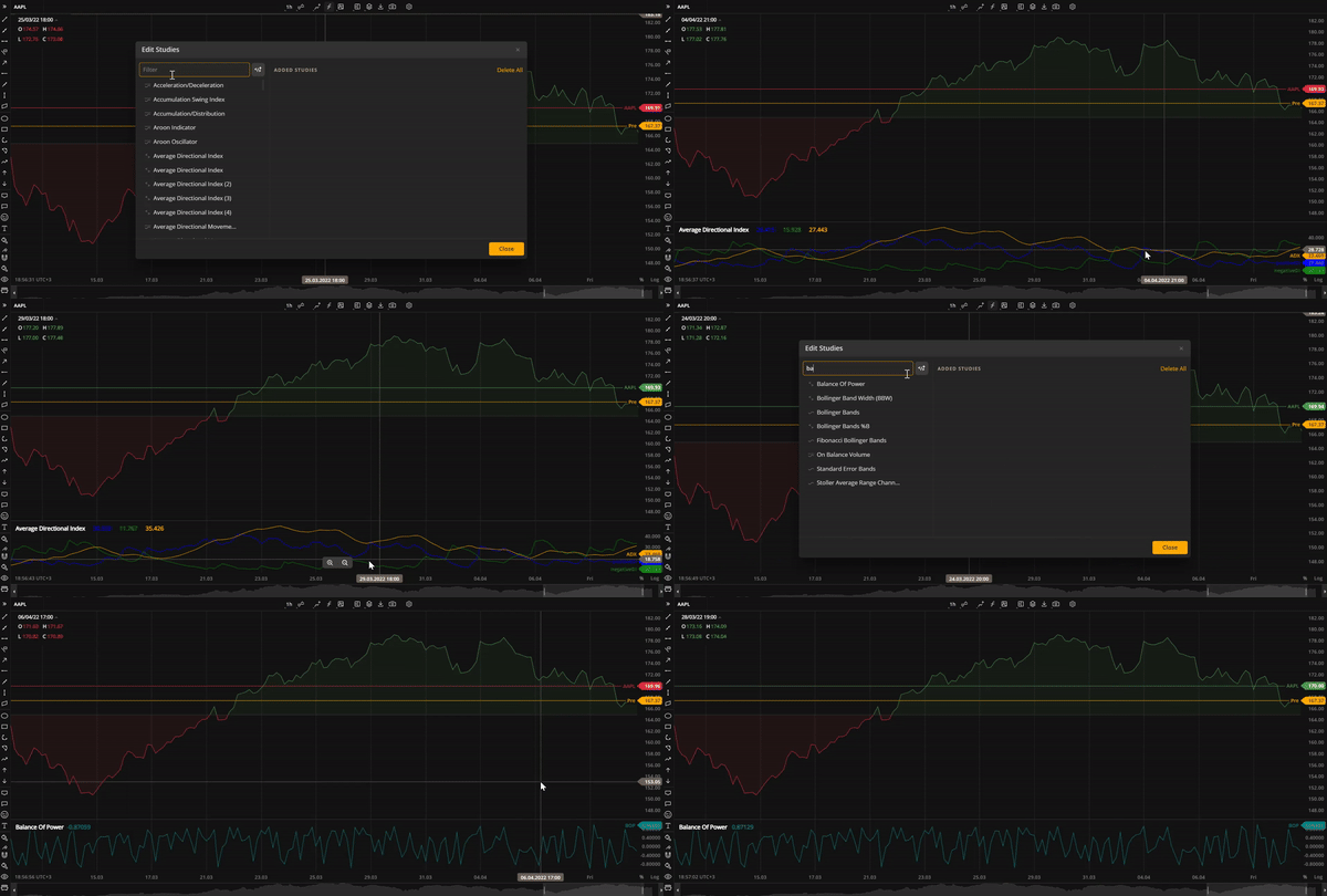 Average Directional Index and Balance of Power studies
.gif) Bollinger Band Width study
Bollinger Band Width study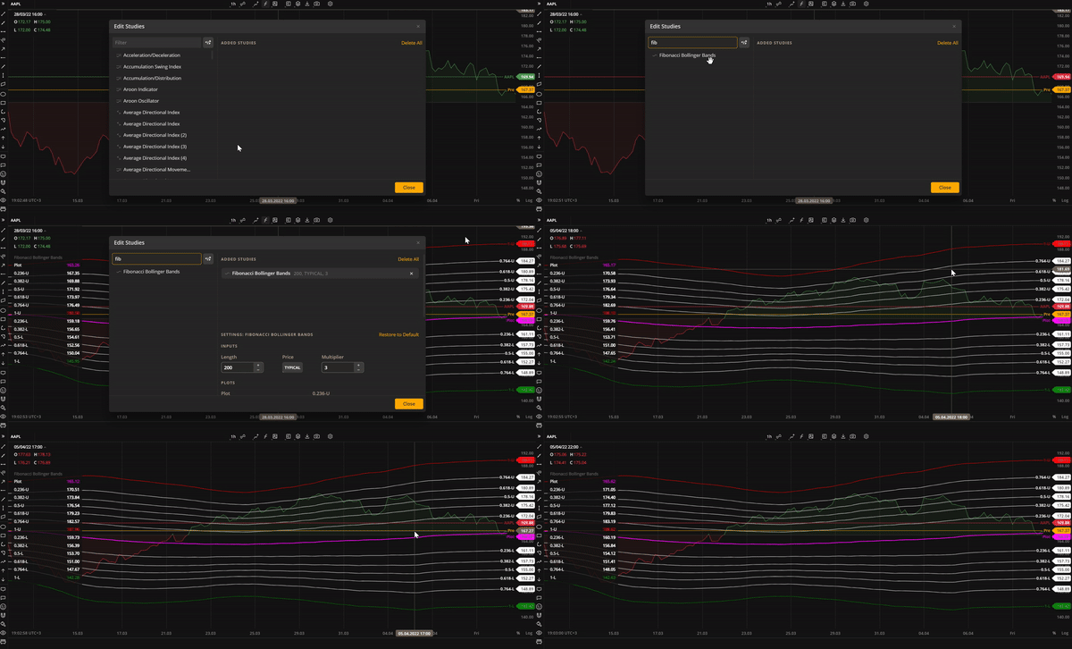 Fibonacci Bollinger Bands study
New Fibonacci drawings
The list of drawings has been increased and now includes the following new items:
- Fibonacci Projection. A variant of the Fib Retracement drawing tool that allows you to identify swing high and swing low points on the chart.
- Fibonacci Time Zone. A series of vertical lines at Fib sequence intervals along the time axis. It helps identify potential areas of importance in terms of time, regardless of price.
- Fibonacci Time Ratio. Another time-based Fib drawing that helps predict potential trend reversals based on elapsed time.
- Fibonacci Time Extension. A time-based drawing similar to the Fibonacci extension. It highlights the time areas of importance where trends are expected to reverse.
- Fibonacci Spiral. A trend-based tool that draws a spiral on the chart using Fibonacci ratios. It is useful for predicting support and resistance areas.
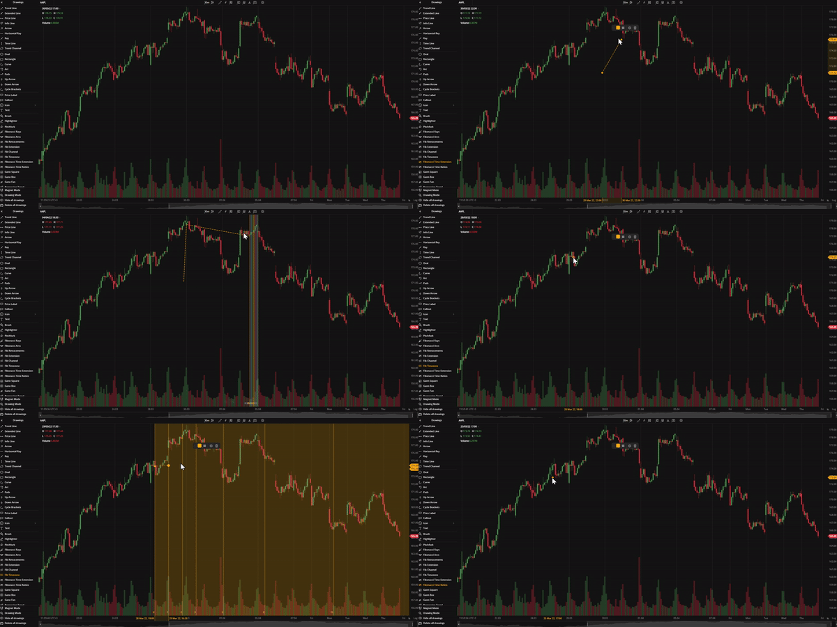 Time-based Fibonacci drawings
Candle improvements: Volume coloring
With this update, the volume bars at the bottom of a candle-type chart (candlestick, hollow candlestick, trend, Heikin Ashi) can have the same color as the candles. For all other chart types, the default color pattern (green and red) is used.
Candle improvements: Hide/Show wicks
Now you can hide or show candle whicks on the chart for better visibility. It can be used with all candle-based chart types. To show or hide candle wicks, click Candle Wick in Settings > General Settings.
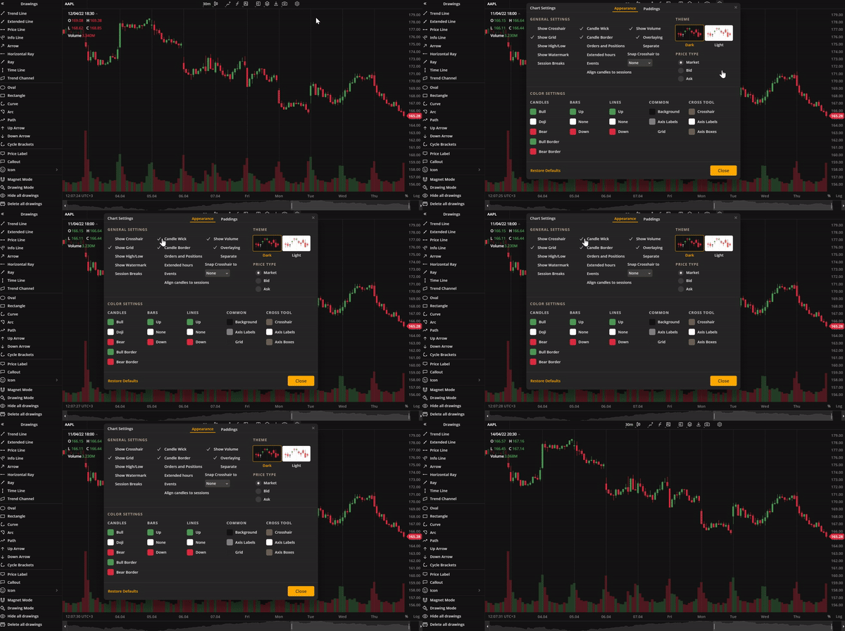 Candle wick
Indicators templates
Another minor but important improvement in our charts is the indicator templates. Now, you can save a list of frequently used studies (indicators) as a template and add them to a selected layout with a single click. For details, see Indicators templates.
Version 4.5.0
Release date: Mar 21, 2022
Responsive UI
We are introducing a responsive user interface to our mobile screens. Now, all chart functionality available on the web is also available on mobile. Additionally, our charts support all iOS touch events and most Android touch events.
Light teme
A light theme has been added to our charts due to popular demand. This allows all traders to have a clearer view of their candles, bars, and lines against a snowy-white background.
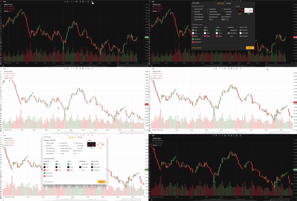 Light theme
Redesigned toolbar
The toolbar, containing chart-related tools and settings, has been updated with a more stylish design and improved functionality. The redesigned toolbar comprises the following clickable icons:
- Symbol Search tool
- Aggregation drop-down list
- Drawings drop-down list
- Compare Instruments tool
- Edit Studies window
- Save Indicator tool
- Mulctichart Layout button
- Chart Values Export button
- Share Chart drop-down list
- Settings window
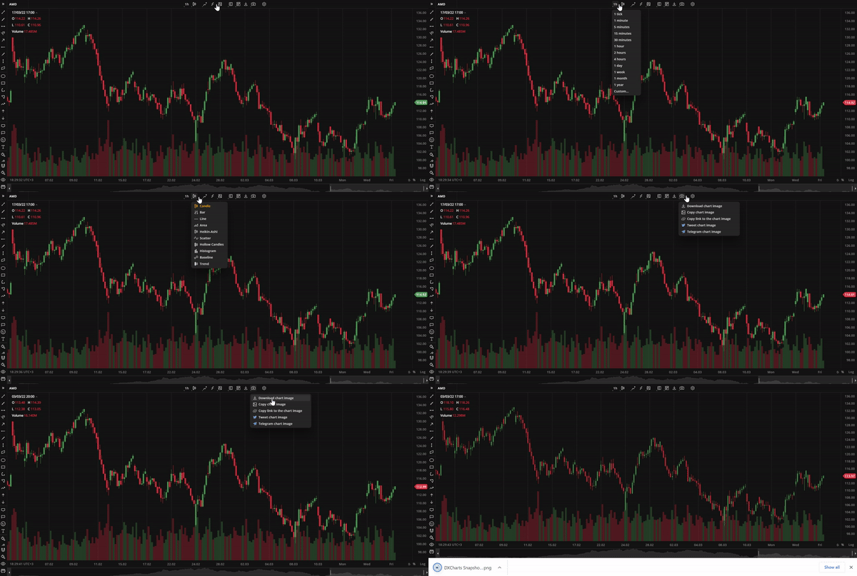 Toolbar
Save chart layout button
The Save Chart Layout button is a new addition to the toolbar. It appears when the user modifies the default chart layout. To save the new layout for future use, click this button and type in the new layout name.
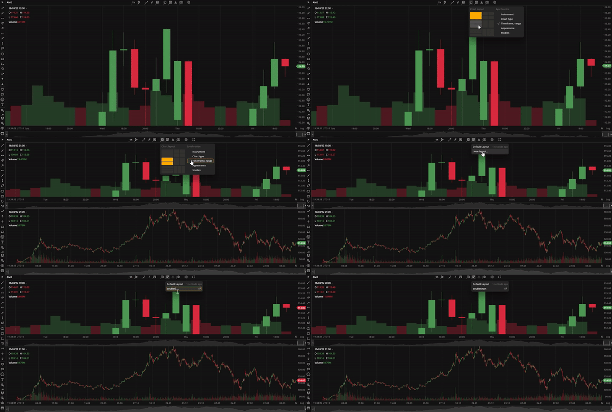 Save Chart Layout button
Price scale improvements
The Price scale has some new features now. Typically, the Price scale is displayed on the right side of the chart. However, traders who use right-to-left scripts as their native language may find this view counterintuitive. Now, they can pin the Price scale to the left side of the screen to make their charting experience more comfortable.
The Price scale also can be inverted, which will flip the candles or bars in an inverted scale mode. Additionaly, the Price scale now includes the option to lock the price to bar ratio. If this function is activated, price change will be locked to bar width. To access both new and old Price scale functions, simply right-click on the Y axis.
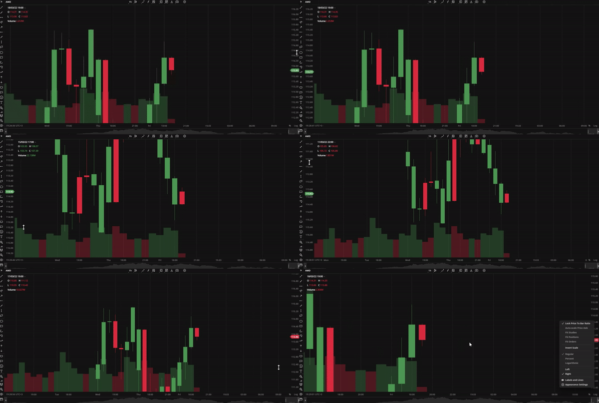 Price sace
Version 4.4.0
Release date: Feb 25, 2022
Basic drawings
We introduce 15 new additions to our drawing lineup:
- Brush. The Brush tool allows users to draw any shape and make annotations on the chart with ease.
- Horizontal Ray. The Horizontal Ray tool draws a line that extends horizontally from the starting point indefinitely to the right.
- Arrow. An arrow-shaped tool that can be used to highlight features on the chart, such as price movements.
- Ray. This tool is similar to Horizontal Ray but it can be extended in any direction.
- Curve. A tool for drawing curved lines.
- Icon. The Icon tool allows users to place icons from a built-in library onto the chart.
- Path. This tool is a chain of arrow-shaped segments that can be used to highlight a sequence of trends or a wave on the chart.
- Extended Line. The Extended Line is a tool that can draw a line that extends indefinitely in any direction.
- Highlighter. Highlighter is a free-form drawing tool that eanbles you to highlight specific details or areas on the chart.
- Info Line. The Info Line tool draws a line that displays the number of bars through which the line spans, the time covered, the distance in pixels, and other relevant information.
- Price Label. Price Label is a tool for labeling specific prices on a chart.
- Callout. Callout is a text drawing tool that allows users to type inside a callout.
- Price Range. This tool displays the price range between two selected prices on the chart vertically.
- Date Range. This tool displays the range between two selected dates on the chart horizontally.
- Date and Price Range. This tool draws a coordinate grid that combines X axis and Y axis using user-selected date points and price points.
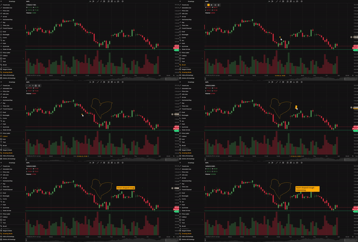 Brush callout
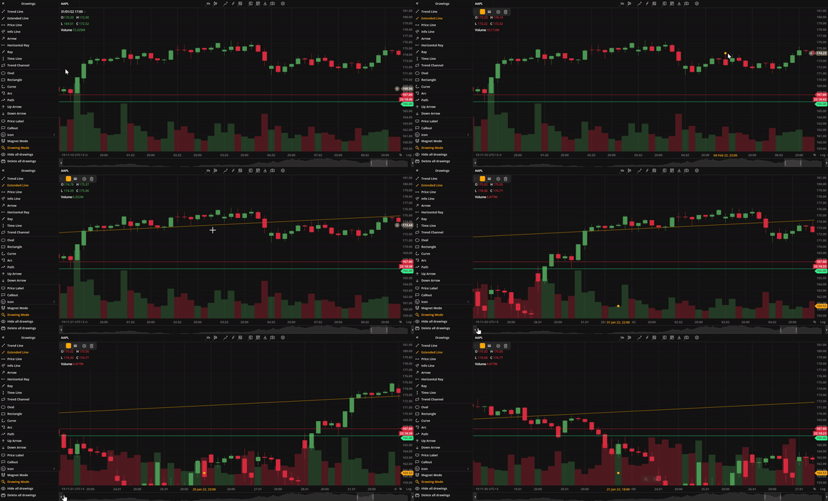 Extended Line
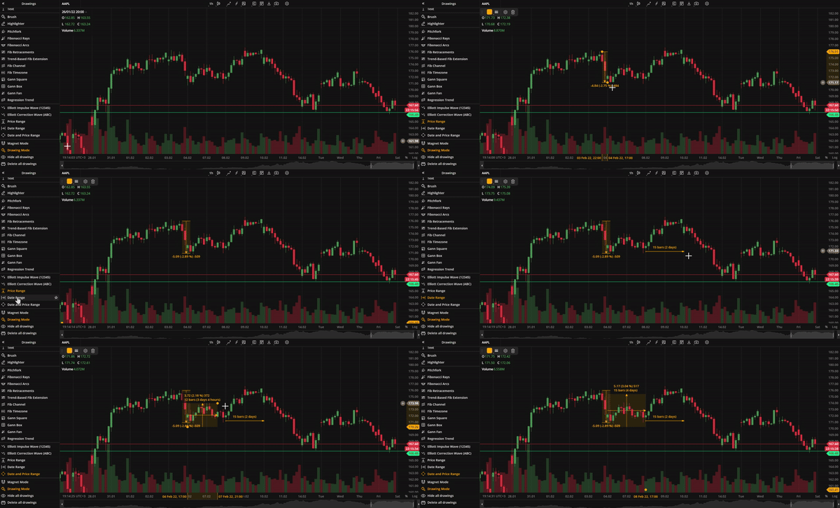 Price date range
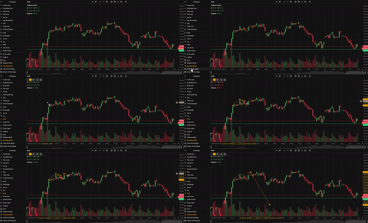 Path
Path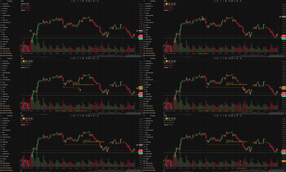 Info line
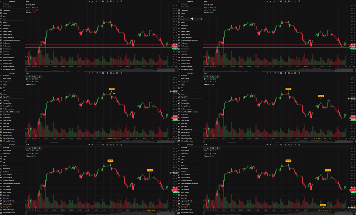 Price label
Drawings sidebar
All drawings are now conveniently located in the left sidebar. The sidebar can be expanded to access individual drawings or collapsed to save space for charts. Additionally, the sidebar includes buttons for managing multiple drawings, such as Magnet Mode, Drawing Mode, Hide All Drawings, and Delete All Drawings.
Magnet mode and Drawing mode
When Magnet mode is enabled, user drawings will snap to the nearest Open, High, Low, or Close price making it easier to visualize trends. In Drawing mode, users can draw multiple instances of the same drawing without having to click the drawing selection button. When these modes are enabled, the respectiev icons in the drawings sidebar are highlighted.
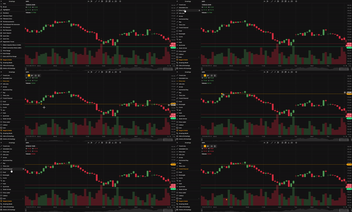 Magnet mode
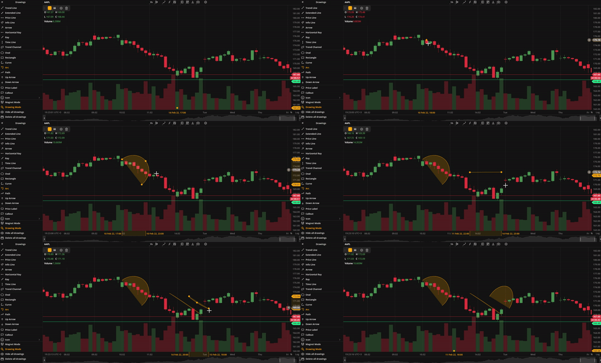 Drawing mode
Version 4.1.0
Release date: Nov 2, 2021
DXscript
The new addition to our charting package enhances its analytical capabilities. DXscript is a domain-specific language for series processing. It's designed to transform one data series into another and is intended for use by individuals without prior programming experience. As a result, studies written in DXscript tend to be concise and comprehensive. Now, you can add as many studies (indicators) as you want with the parameters you want.
.png) Adding a custom indicator
Adding a custom indicatorFour new chart types
We have added four new chart types to provide users with more versatile charts and additional technical analysis capabilities. These time-based charts are essential for technically-minded users to save time and focus on more complex tasks.
| A scatterplot is a chart that shows prices as dots scattered across the chart, with no connecting lines. When zooming in, close prices are shown. This chart type is useful for identifying correlations between two or more data points, as well as outliers or data gaps. For details, see Scatterplot. | Hollow Candles plot the difference between the close and open of the current bar, as well as nearby candles. For details, see Hollow Candles. |
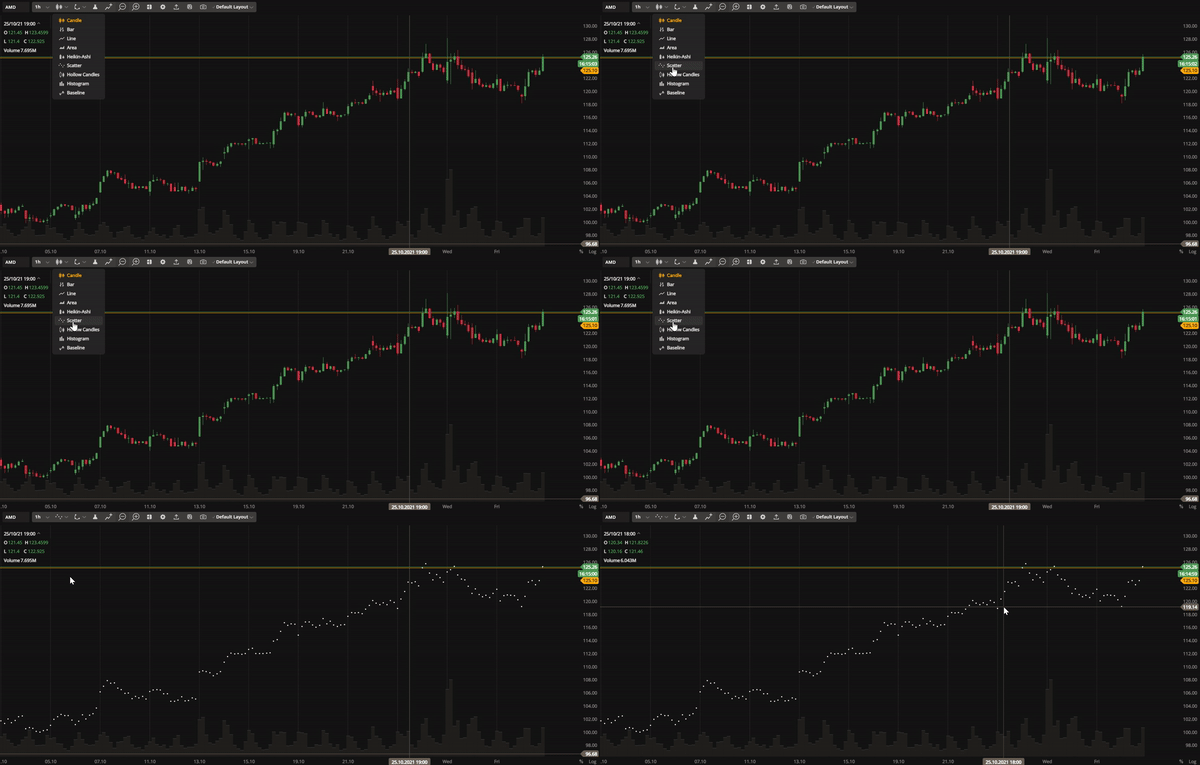 Scatterplot | 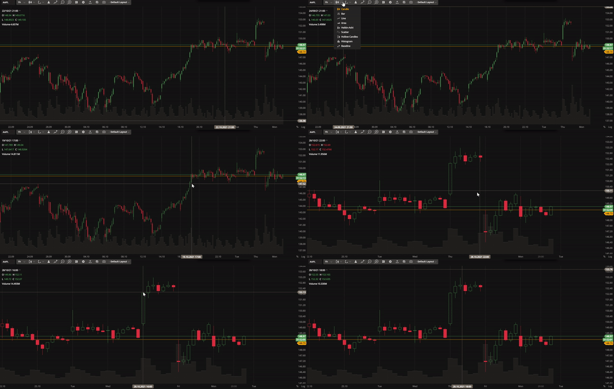 Hollow Candles |
| Histograms are useful for displaying the distribution of variables. They allow traders to identify peaks, outliers, and patterns such as skewness or symmetry. For details, see Histogram. | The Baseline chart shows price movements in relation to a trader-selected baseline, which can be helpful in analyzing price fluctuations. For details, see Baseline. |
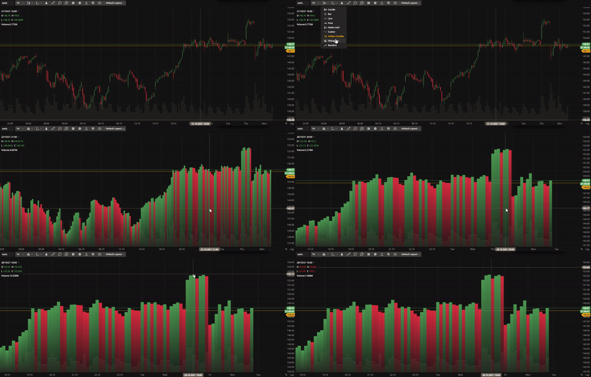 Histogram | 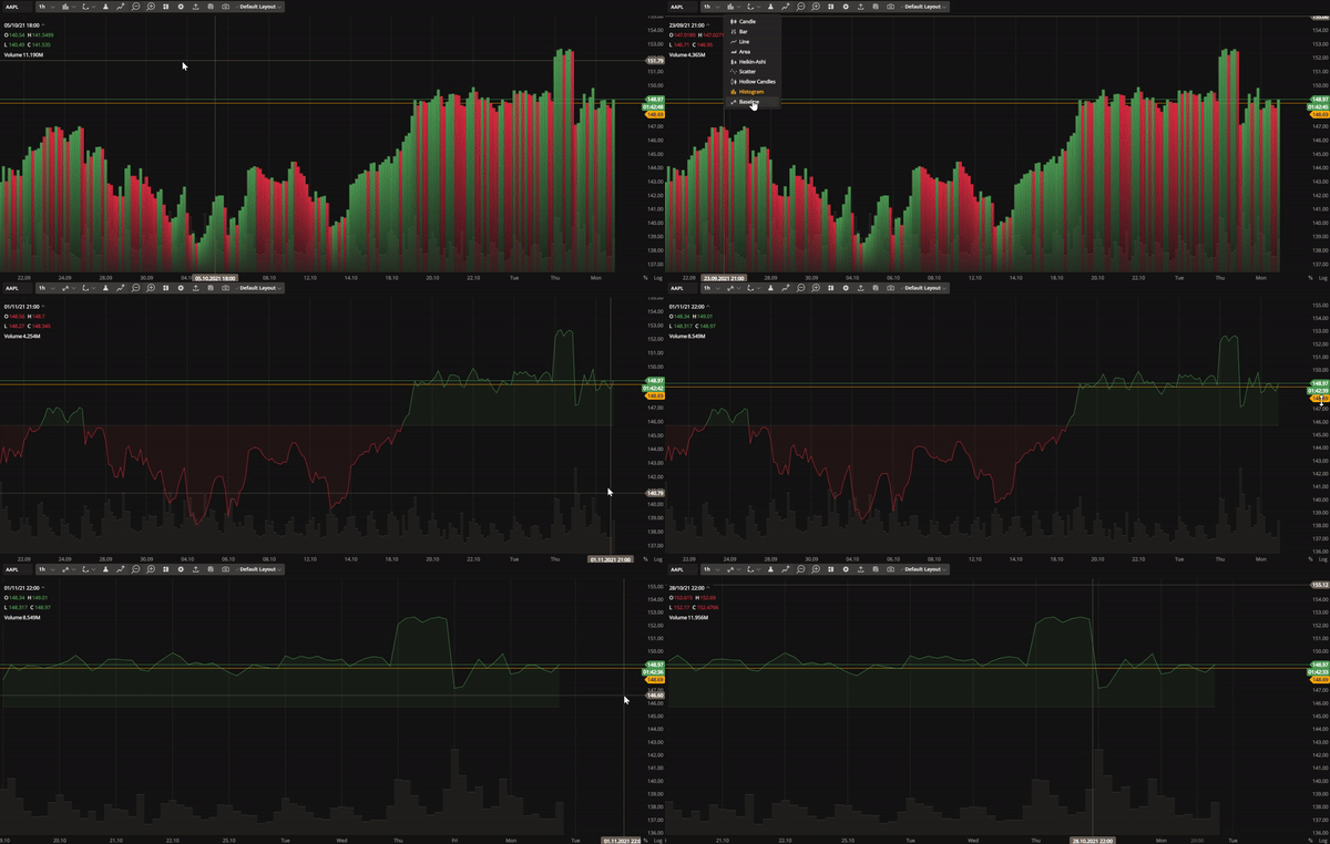 Baseline |
Trade from the chart
You can now buy or sell instruments directly from the chart using our mini order entry feature. This allows you to place Market, Limit, Stop Loss, or Take Profit orders without losing sight of the chart. The system will automatically group your orders if they are close to each other. In addition, you will always know how your future order will affect you because the PL is calculated automatically. To enable the Trade from the chart, select Orders and Positions in the Settings. A plus sign will then appear on the price axis.
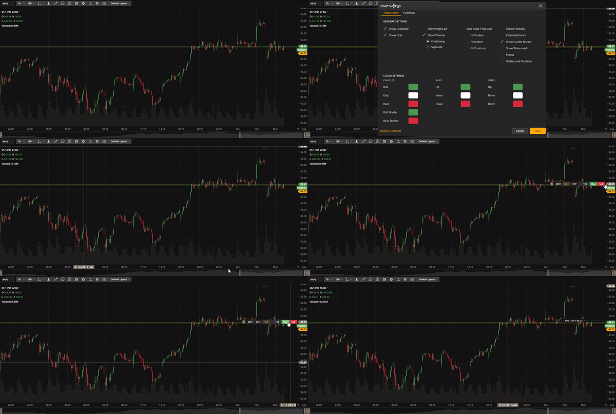 Issue multiple order types from the chart
Toolbar improvements
To save space and simplify the user interface in the multichart mode, we have replaced an individual toolbar for each chart with a single toolbar that controls them all at once. Simply click on the chart you want to control to select it. You can also customize the order of the buttons within the toolbar as needed.
.gif) Use a single toolbar to control multiple charts
Use a single toolbar to control multiple chartsEven more drawings
New drawings have been added. These include Arc and Fibonacci Arcs, Fibonacci Retracements, Fibonacci Channel and Fibonacci Timezones; Gann Fan, Gann Box, Gann Square; Elliot Impulse Wave, and Elliot Correction Wave.
The drawings allow technical analysis and market trend tracking. See the full list of drawings here.
Version 3.5.0
Release date: Apr 26, 2021
Corporate events on chart
We've added the ability to display important financial events such as earnings, dividends, and splits on the chart. To enable the Events on chart, go to Settings and select Events. The markers with additional information about the event will appear on the time axis below the chart.
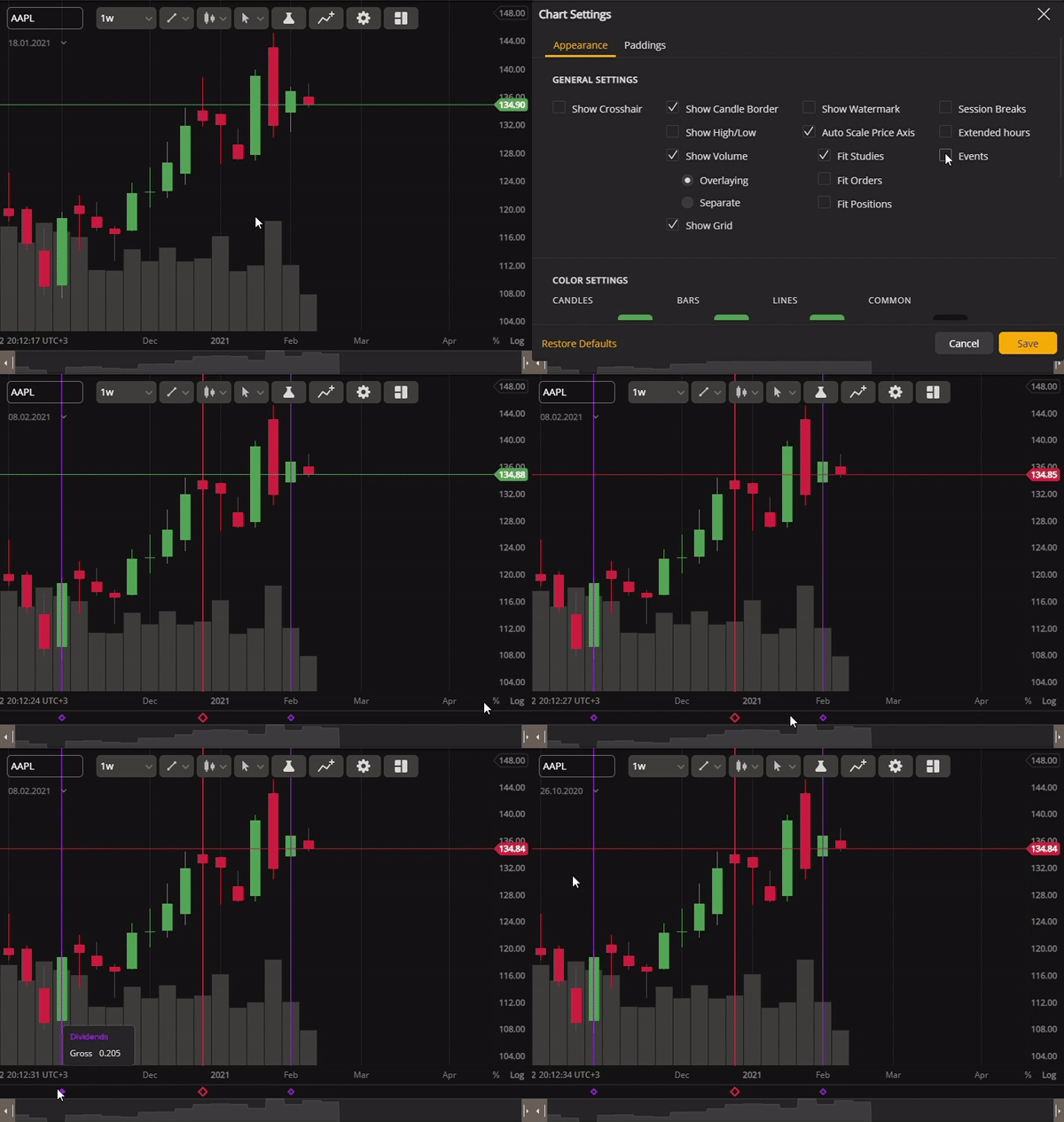 View corporate events on chart and track their effect
Price scale improvements
Our price scale has been updated with more information and is now easier to use. You can display labels and lines on your chart or switch to a logarithmic scale by right-clicking on the price axis.
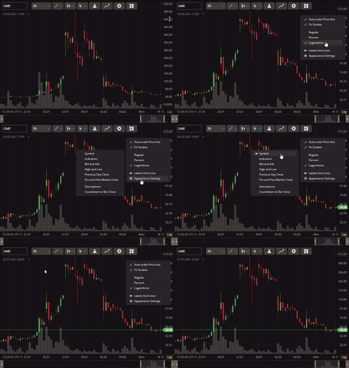 Switch to a logarithmic price scale and display labels
Custom aggregation period
Previously, you could only choose from a set of candle aggregation periods on the chart. Now, you have the option to enter your own custom aggregation period. To do so, click on the arrow next to the aggregation period, select Custom, and type in your desired aggregation period (e.g. 6m). The chart will then display the candles (bars) aggregated for this period. You can also remove any aggregation period from the list including the default ones.
Version 3.0.0
Release date: Dec 15, 2020
Multichart sync studies
DXcharts can now synchronize studies (indicators) across multiple charts. To do this, go to Multichart on the toolbar and select Studies in the Synchronize column. Any study added to a chart will be automatically applied to all charts, and the study settings will be synchronized across charts. If you remove a study from the selected chart, it will also be removed from all other charts in the series.
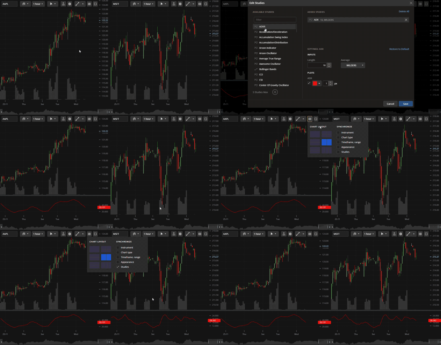 Synchronize studies on different charts
Compare charts
The Compare charts feature helps traders to analyze and reveal correlations between multiple instruments. It allows you to view price plots for several instruments simultaneously, with each plot showing the price as a percentage of the first candle's close. You can add up to 5 price plots to a chart.
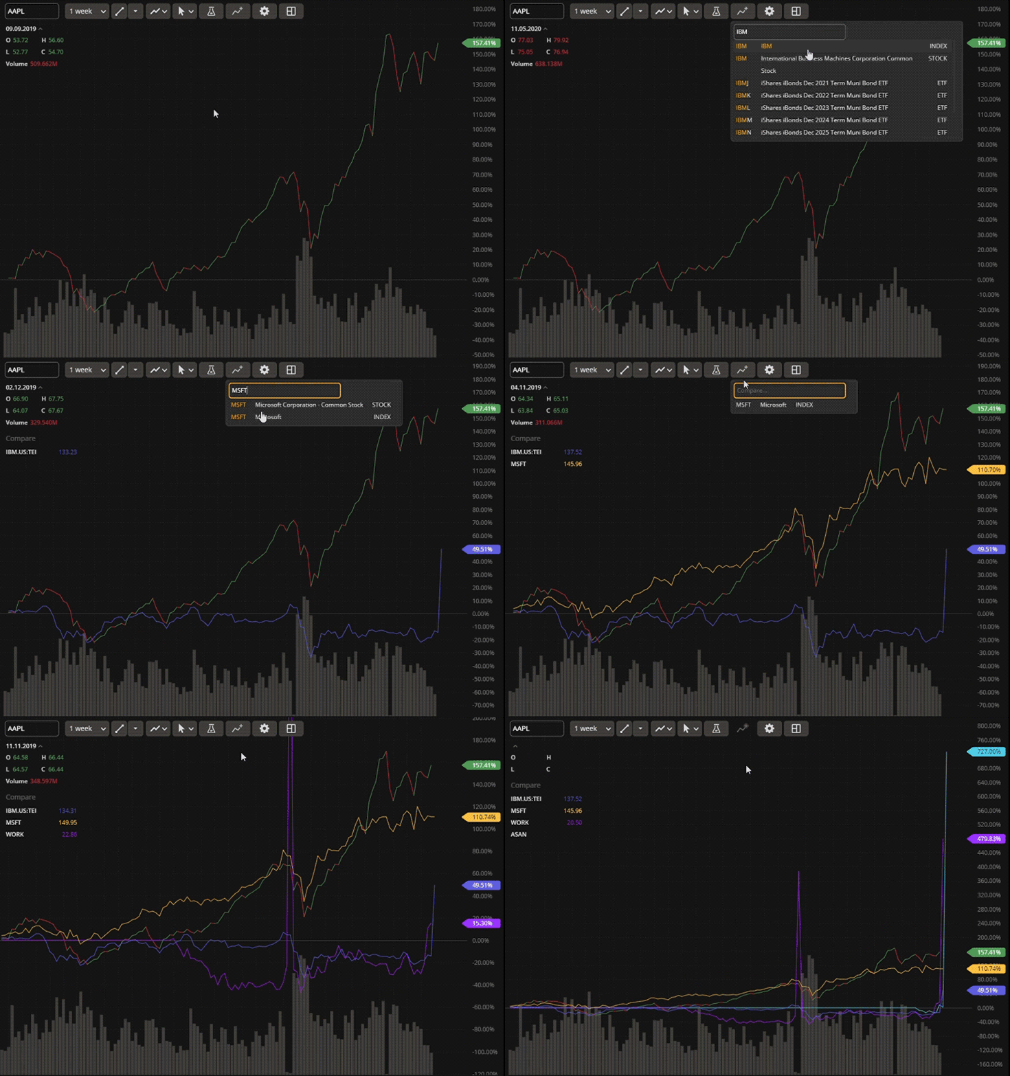 Compare charts to reveal correlation between instruments
Reworked data box
Data Box displays the current open, high, low, and close prices, volume, and study values on your chart. The design has been improved to allow for easy folding and expanding the box. Additionally, values are now automatically shortened to fit in one line for clarity and conciseness.
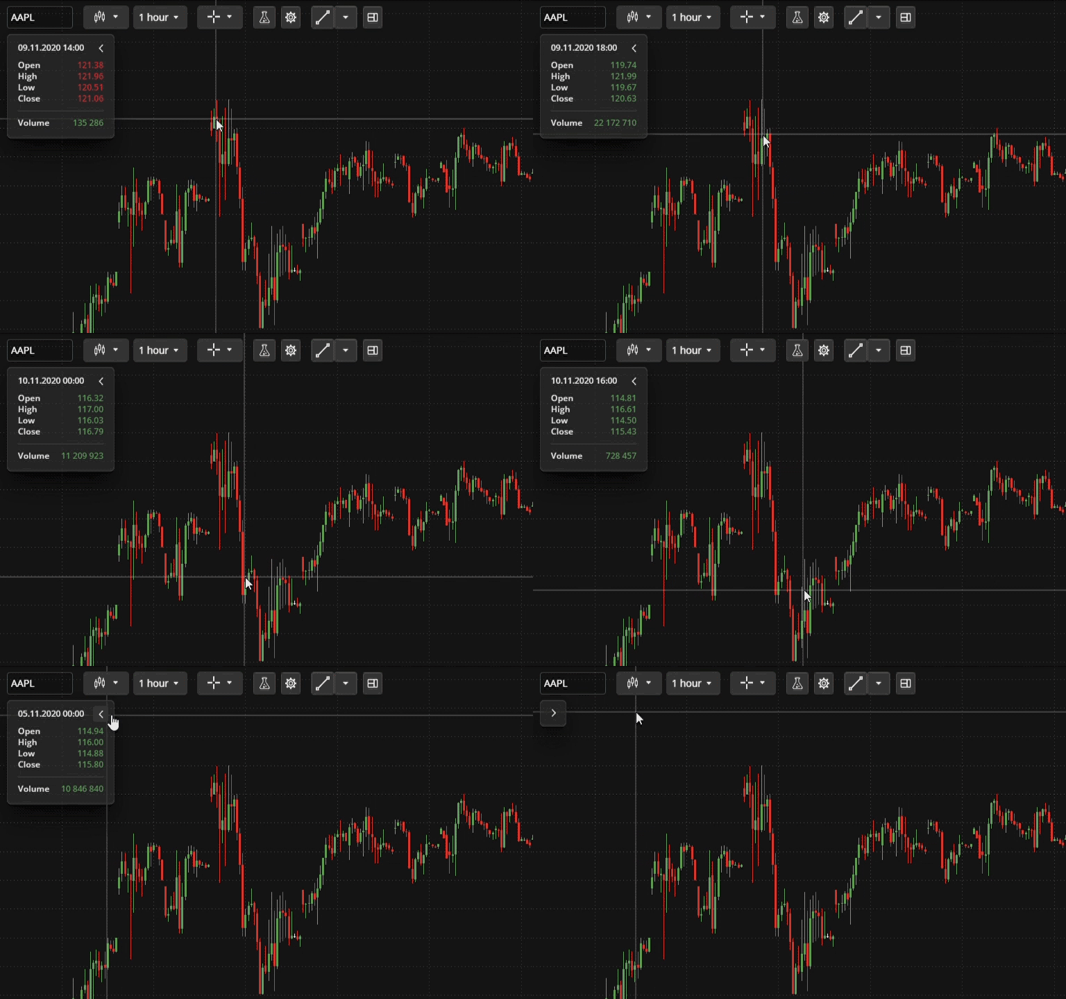 Redesigned data box to display OHLC, volume, and study values


