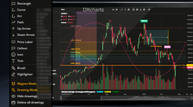
We are now in the new and exciting year of charting at full speed. This time in February, we’ve prepared a mammoth update. It’s so huge we had to split it into parts. This part is about our new and improved drawings. Read on!
Basic Drawings
Having fun with Fibonacci Retracements or Gann Box? How about more basic drawings such as Brush, Arrow, Curve, or Path? “Basic” does not imply “less advanced”: these drawings may look simpler but they are literally the “base” for your technical analysis.
Please welcome 15 new additions to our drawings lineup:
1. Brush. The main goal of Brush is to give users freedom in drawing any shapes they want on the chart and making annotations anywhere on the chart.
2. Horizontal Ray. This tool draws a horizontal line that extends from the point of origin to the right indefinitely.
3. Arrow. An arrow-shaped tool that can be used to highlight features on the chart, such as up-down price movements.
4. Ray. A line-drawing tool similar to Horizontal Ray but can be extended in any direction.
5. Curve. A curved line drawing tool.
6. Icon. A tool for placing objects (icons) from a library on the chart.
7. Path. A chain of arrow-shaped segments that can be used to highlight a sequence of trends or a wave on the chart.
8. Extended Line. A tool that draws a line that extends indefinitely in any direction.
9. Highlighter. A free-form drawing tool that allows to highlight a detail or an area on the chart.
10. Info Line. A line-drawing tool that displays the number of bars through which the line spans, time covered, distance in pixels, etc.
11. Price Label. A labeling tool that allows pinpointing a specific price on a chart.
12. Callout. A text drawing tool similar to the existing Text drawing but there users can type inside a callout.
13. Price Range. A tool that shows the range between two different prices selected vertically on the chart.
14. Date Range. A tool that shows the range between two different dates selected horizontally on the chart.
15. Date and Price Range. A combined tool that draws a coordinate grid with X axis and Y axis, the endpoints of these axes being user-selected date points and price points.
Take a closer look at some of these drawings:
Drawings Sidebar
Now all drawings are collected in the left sidebar that can be expanded to allow access to individual drawings or collapsed to save space for charts. The drawings sidebar also includes buttons for managing multiple drawings such as Magnet Mode, Drawing Mode, Hide All Drawings, and Delete All Drawings.
Magnet Mode & Drawing Mode
When Magnet Mode is on, user drawings will be snapped to the nearest Open, High, Low, or Close to make it easier for the user to visualize trends. In Drawing Mode, users are free to draw multiple instances of the same drawing without having to click the drawing selection button. When these modes are enabled, the respective icons in the drawings sidebar are highlighted.
We’ll get back to you with more drawings-related updates in no time! But wait, here’s a minor fix for you: now you can use the Delete button on MacOS to remove text notes, just like with any other drawing: a small but convenient feature. In the meantime, happy charting and…
Stay tuned,
The DXcharts team

