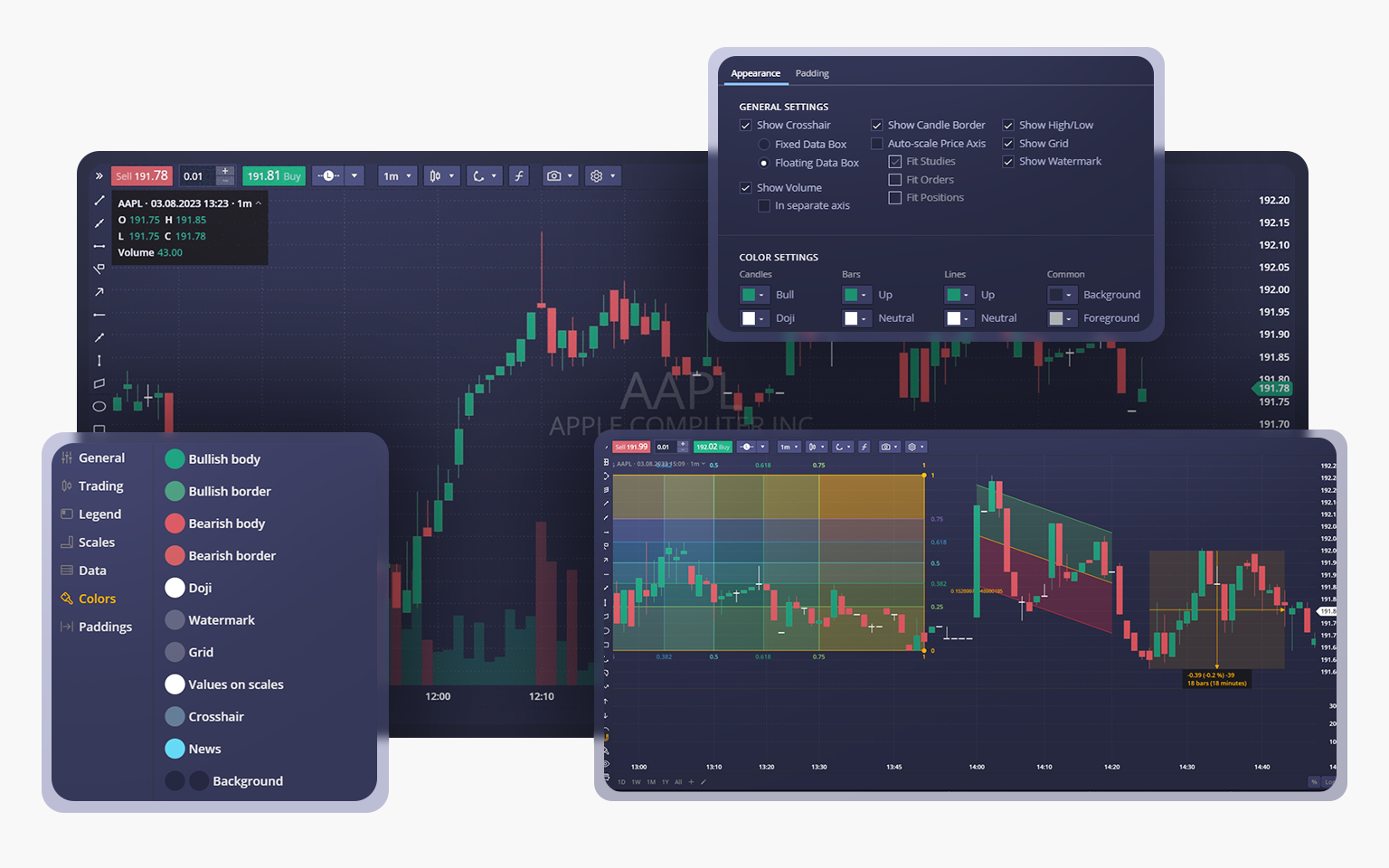
We are pleased to announce a remarkable update to the charting package for DXtrade CFD/Crypto. The chart now offers an abundance of capabilities: a wide range of chart types, additional technical indicators, and a comprehensive set of drawing tools. This update also introduces several exciting features such as a data box, snapshots, new settings for the price scale, and a revamped chart settings menu. Read on for more details about these enhancements!
Chart types
In this update, we’re introducing six new chart types designed to enhance traders’ versatility, offer additional technical capabilities, and take your market insights to new heights.
The new chart types are now at your service in the platform. Here are brief descriptions of each of them:
Area
The Area chart shows the closing prices and highlights the whole area between the zero level and closing prices.
Heikin-Ashi
The Heikin-Ashi chart is plotted with candles, but they are calculated according to the Heikin-Ashi formula which filters out the market noise.
Scatter
This chart type shows prices as dots scattered on the chart. Scatterplot charts are useful for identifying correlations between two or more data points. They are also handy for highlighting outliers or data gaps.
Hollow candles
Hollow Candles plot the difference not only between the close and the open prices of the current bar, but also the difference between nearby candles.
Histogram
In the Histogram chart, closing prices are displayed as a series of columns. The column colors depend on whether the current closing price is greater or lower than the current opening price. The Histogram chart helps identify peaks and visualize distribution patterns.
Baseline
The Baseline chart has a middle line (adjusted manually) that separates price movements into up and down areas. The areas are highlighted, which can be very helpful in analyzing price fluctuations.
Data Box
Beginning with this update, you’ll notice the addition of the data box, conveniently located in the top-right corner of the chart. The data box serves as the legend that showcases essential information, including OHLC values, aggregation period, volume, current date and time, as well as the name of the selected instrument. The data box can be easily folded or expanded by clicking the header.
Additional drawing tools, hide and clear actions and modes
To further enhance your charting experience, we’ve added a bunch of new drawings: there used to be 13, now there are 42! We hope these freshly added tools will enhance charting capabilities and help you spot trends as fast as possible.
You can now also utilize the Hide All Drawings and Clear All Drawings actions for easy management and removal of drawings.
Aside from the main toolbar, the drawings are always available on the left side of the charts. By the way, there you can find two modes to control the drawings:
- Magnet Mode. Turns on/off the ability to snap drawings to the candle elements.
- Drawing Mode. Turns on/off the ability to continuously create drawings of the same type on the chart without selecting the drawing tool every time.
Snapshots
Another important addition to this update is the highly anticipated Snapshot feature. Now, this new functionality allows you to save chart images to your computer or copy & paste them wherever needed, making it easier to share trading analysis.
Even more indicators
The charting package has also been expanded with six new trading indicators designed to assist day or swing traders in analyzing market fluctuations and making informed decisions regarding the buying or selling of various assets.
All the new indicators can be used individually or in combination to conduct technical analysis on the charts:
- WaveTrend
- WaveTrend with Crosses
- Williams Fractal
- TD Sequential
- Pivot Points
- Kaufman Adaptive Moving Average
Revamped chart settings
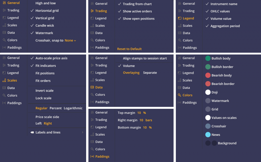
The Chart Settings menu has been reorganized to provide you with a more streamlined and intuitive interface. The settings are now neatly arranged into thematic tabs. Similar to the previous version, you can access the Chart Settings menu to show or hide objects, customize colors, set paddings, etc.
Price scale
The new Price Scale settings have been redesigned and complemented with some new functionality too. Now, you can seamlessly switch between logarithmic and percentage scales or display labels and lines directly on the chart.
The Price Scale can be flipped upside down or inverted. In an inverted scale mode, candles or bars will be flipped too. Another function added to the Price Scale is Lock scale. If this function is activated, price changes will be locked to bar width.
That’s it! We’ve reached a milestone in our current release. We hope the new charting capabilities will undoubtedly help you experience the power of DXtrade CFD/Crypto.
Stay tuned,
The DXtrade team


